If you search for a CSS Grid-based framework, you are out of luck...
Instead, you will find articles centering around the question of when to use one over the other. But why? In order to understand that, let's look a little into history: In a few days twitter bootstrap will celebrate its 7th birthday. From the very first version on, the CSS framework quickly became the most influential candidate when choosing to design web-layouts. At that time the word responsive was coined and everybody wanted to get in on it. However, browsers weren't really up to par with the growing mobile usage. How did bootstrap do it? In version 1: not at all. In version 2: With float! This meant "hacking" custom margins into first and last children and clearing using the pseudo-class after on the level of the parent. And breakpoints: how about one single breakpoint?
It was solid and browser compatible at the time, but it seems to have set a particular markup in stone: the "row" is a necessary container, the elements themselves decide their size/behavior:
<p>Bootstrap 2.0</p>
<div class="row">
   <div class="span6">col 1</div>
   <div class="span6">col 2</div>
</div>
With version 3 declarative breakpoints entered, making it possible to define behavior for various screen sizes:
<p>Bootstrap 3.3</p>
<div class="row">
   <div class="col-xs-12 col-md-8">col 1</div>
   <div class="col-xs-6 col-md-4">col 2</div>
</div>
This form of markup never changed. The CSS world has moved to flexbox and more breakpoints dictate more capabilities, but all frameworks you will find will likely use similar markup, creating HTML like this:
<div class="row">
  <div class="col-xs-12 col-md-6 col-lg-4">col 1</div>
  <div class="col-xs-12 col-md-6 col-lg-4">col 2</div>
  <div class="col-xs-12 col-md-12 col-lg-4">col 3</div>
</div>
And we all think that's normal and are used to fighting with our HTML on multiple class-declarations when making changes to our column-behavior.
Enter CSS grid
With modern capabilities, one would think meanwhile a couple of revolutions would have occurred. But no, we still write grids like that. CSS grid works way easier than that. So easy, that people seem to either supplement frameworks with native CSS grid or avoid CSS frameworks all together. However, aren't there way too many things in modern CSS frameworks you wouldn't want to live without? Why aren't there any frameworks built around this concept?
Revelation 1: Tailwindcss
If you haven't heard of tailwind, you are behind. The concept has such an impact on the way we design the web, many of the utility class concepts are now part of popular other frameworks. And if you understand how to use tailwind, it is already 80 % of what we want to talk about today: a framework-builder rather than a framework. Why? Because utilizing plugins and preprocessors the right way let you build whatever you need. So combining tailwind with CSS-grid and using your own compositions (in tailwind referred to as base styles) should do the trick? Kinda. The problem is more from a practical perspective: Plugins, Webpack, postCSS, and additional markup is a lot of work for starting a project while using it "out-of-the-box" a rather tedious task due to the amount of classes you write. It's still the coolest thing out there, but unfortunately not approachable for the casual user or beginner.
Revelation 2: Gaudiamus-css
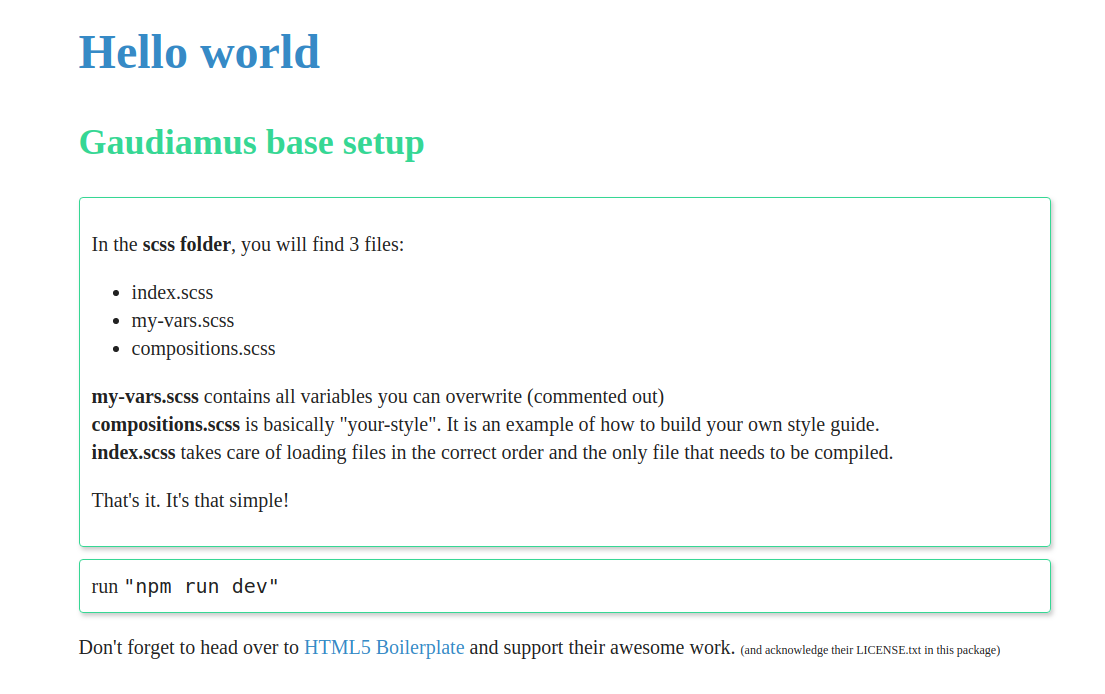
The concept of Gaudiamus is to expose relevant variables to enable a relatively simple way to modify and even create utility classes. While not as powerful as tailwind, it has two features that stick out:
Grid
We talked about this a couple of paragraphs above: the way we define grid-systems is painful. Integrating CSS-Grid into a framework enables you to convert the "bootstrap-way" of writing this:
<div class="row">
   <div class="col-xs-12 col-md-6 col-lg-4">col 1</div>
   <div class="col-xs-12 col-md-6 col-lg-4">col 2</div>
   <div class="col-xs-12 col-md-6 col-lg-4">col 3</div>
   <div class="col-xs-12 col-md-6 col-lg-4">col 4</div>
</div>
Into this:
<div class="grid-12 md:grid-6-6 lg:grid-4-4-4">
   <div>col 1</div>
   <div>col 2</div>
   <div>col 3</div>
   <div>col 4</div>
</div>
Class constructor
Secondly, it is very simple to create your own CSS with the use of provided sass-maps. You want a particular color to be named "danger" and generate utilities for it? No problem, setting to variables will generate classes like
- text-danger (color)
- bg-danger (background color)
- b-danger (border)
- hover:raise-1-danger (on hover, provide "danger"-colored dropshadow with a depth of one spacing-unit)
- ...
In the last step, we can create compositions based on regular SASS:
.btn {
   @extend .b-1, .b-rounded, .p-x-2, .p-y-1;
}
.btn-danger{
   @extend .btn, .text-white, .bg-danger;
}
// you can also use the generate-classes mixin to generate
// all variations of all colors & states, but let's keep it simple here
The result is easy to use and requires only basic knowledge of SASS (here scss to be precise). Check it out!


